BRAND IDENTITY, SOCIAL MEDIA, WEBSITE DESIGN, CONTENT CREATION, WEBSITE DEVELOPMENT, PRODUCT PHOTOGRAPHY, PHOTOGRAPHY ART DIRECTION
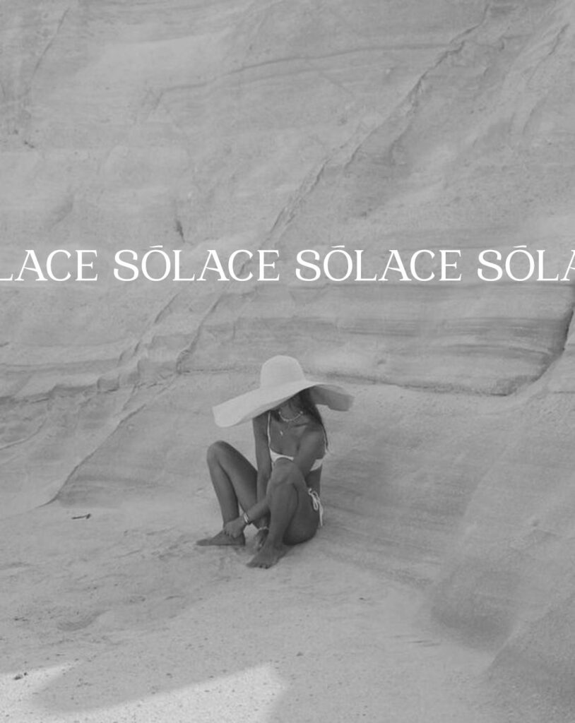
Solace is a modern sauna house designed to bring warmth, restoration, and stillness back to the body. As a sister brand to Thaely, Solace needed to feel like an extension of the same values — rooted in care, attuned to nature, and deeply human — but with its own identity and presence. With clarity around the vision from the beginning, we developed a single, intentional brand concept that felt immediately aligned.


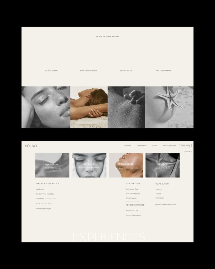
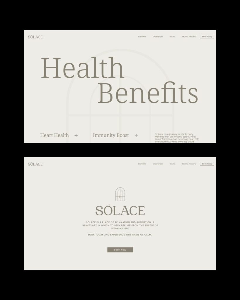
We designed a single concept logo inspired by the actual doorway to their clinic, shaping the icon as both literal entrance and symbolic passage. The typography mirrors their umbrella brand, Aescend, creating cohesion across the business ecosystem while still giving Solace its own distinct softness. The website was designed as a simple, scrollable experience — making it easy for clients to book, learn, and return to the ritual of warmth.


“Once again, MOK just got it. The logo is genius — using the actual doorway from our space blew me away. It’s so subtle but so meaningful. The whole process felt effortless and intentional. The website is clean, easy, and exactly what we needed. I wouldn’t trust anyone else with our brands.”
[Founders, Sōlace]
We curate brands that feel as good as they look. Ready for your idea to come to life?