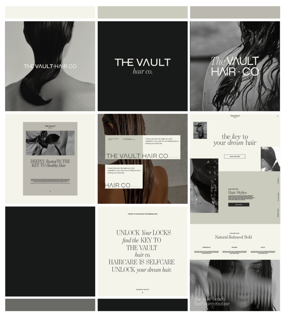
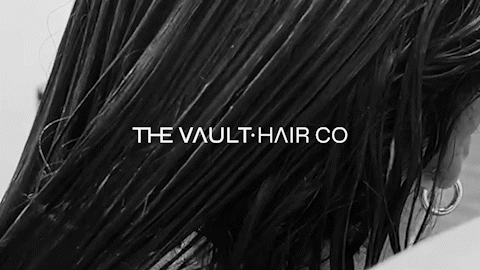
Our intention for The Vault brand was to bring comfort and sophistication to the hair industry — timeless yet trendy; following the industry trends to give full inclusivity. Rooted in intentional minimalism, the core of the brand is shown in black and white, drawing in subtle natural textures and vintage-inspired details, reimagined.
THE VAULT HAIR CO. CHINO, CA
THE CLIENT
Think of The Vault as your home away from home. Creating a hair salon where people feel comfortable was at the core of the brand and we used this value to be the core of the design process.
THE BRIEF
When The Vault approached us, they had a clear vision: to bring a sense of comfort and sophistication to the hair industry. Their goal was to create a brand that felt both timeless and trendy, capturing the essence of modern elegance while staying grounded in inclusivity. They wanted to keep pace with industry trends while embracing a broad and diverse audience.
At the core of The Vault’s vision is a commitment to intentional minimalism. The brand’s identity would be centered around the use of black and white, drawing on subtle natural textures and vintage-inspired details. The aim was to reimagine these elements in a fresh and modern way that would speak to both tradition and innovation.
The Vault’s brief was clear: they wanted a brand that would stand out in the industry, offering a unique blend of refinement and approachability, and one that would grow with them over time while remaining eternally relevant.
THE SERVICES WE PROVIDED
Brand Strategy, Creative Direction and Design
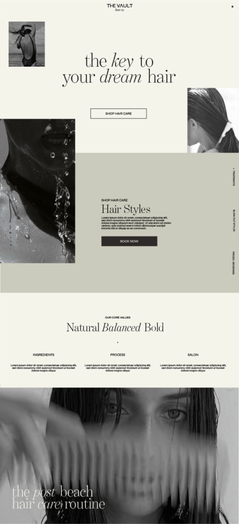
Custom Showit Website
Social Media Marketing
THE RESULTS
When developing the design for The Vault, we wanted to break away from the common trend in the hair industry where many brands are focused exclusively on female audiences. The Vault’s vision was clear: to be inclusive, welcoming all genders and ages. We embraced this by carefully considering how to present the brand in a way that felt both inviting and bold, ensuring it appealed to a wide range of clients while retaining the sophisticated and luxurious feel they desired.
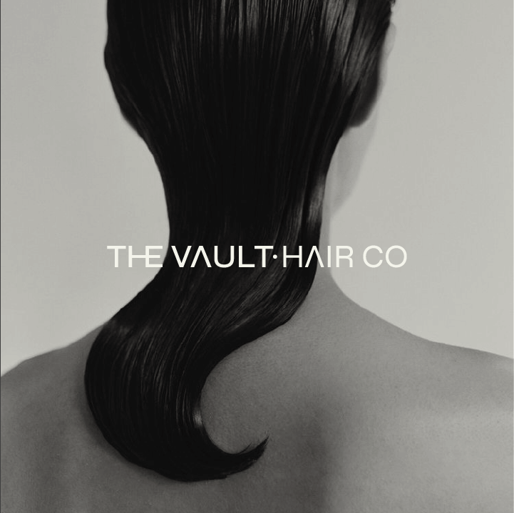
The primary logo design was crafted with the intent to convey inclusivity and expertise. The bold, modern font Syne was chosen to give the brand a strong, contemporary presence. We wanted the logo to feel open and welcoming, which is why the “HE” in the logo is connected, signaling that The Vault is a salon that is accepting of everyone. The connection of the letters visually reinforces the idea that the space is comfortable, emphasizing the importance of feeling at ease while in the salon chair.
An interesting detail in the design is the A, which intentionally omits the middle line. This subtle touch symbolizes The Vault’s willingness to help fix any hair “uh-oh” moments, like a client’s previous salon mishap. This speaks to the brand’s commitment to client satisfaction—assuring them that no matter the situation, The Vault is there to achieve their hair goals.
The dot in the logo, positioned between “The Vault” and “Hair Co.,” serves a dual purpose. Not only does it split the words for clarity, but it also acts as a brand symbol, much like the swoosh for Nike or the apple for Apple. It represents the keyhole of a vault, tying directly into the brand’s name and reinforcing its identity. The dot is an important part of the brand’s visual language, symbolizing access, unlocking potential, and providing that sense of exclusivity.
In terms of overall brand language, we emphasized words like “Luxury,” “Inviting,” and “Bold” to convey the feeling that clients are receiving the highest level of service. “Unlock” and “The Key” became central to the messaging, tying back to the vault metaphor and highlighting the brand’s role in helping clients discover their ideal look. The Benton font was chosen for its timeless, luxurious feel, ensuring that The Vault’s identity would remain relevant and elevated over time.
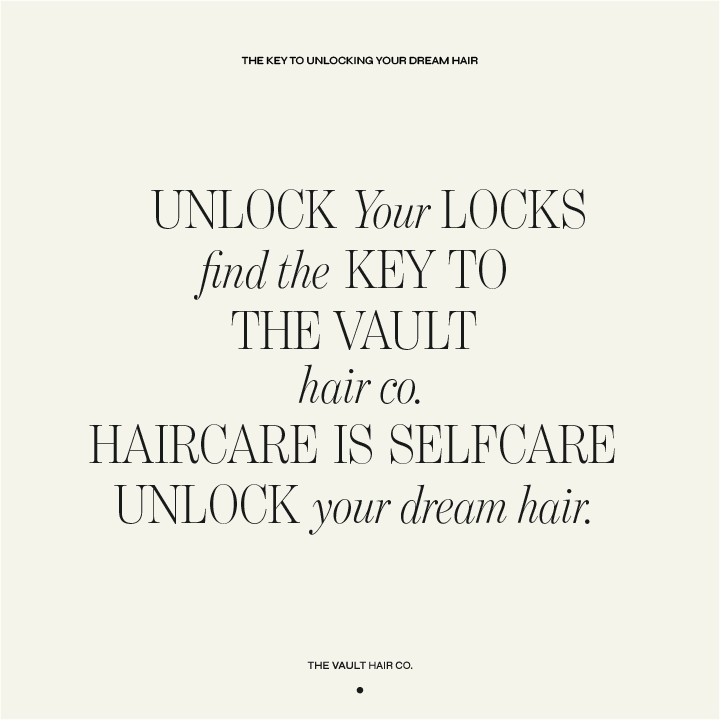
Through the design process, we also created phrases like “Unlock Your Locks,” “Find the Key to the Vault,” “Hair Care is Self Care,” and “Unlock Your Dream Hair,” which were incorporated into their messaging. These phrases encapsulate The Vault’s ethos and position the brand as a destination for those seeking a luxurious, inclusive, and transformative hair experience.
We used the one-concept method to streamline the decision-making process, presenting The Vault with a single, cohesive brand concept that embodied everything they had envisioned. This approach allowed us to showcase the thought and intention behind each design element in a clear and concise way. The client was thrilled with the result, as it perfectly aligned with their vision of a welcoming, inclusive, and sophisticated brand. They were over the moon with how the design captured the essence of their values, and it was clear that this brand identity was the perfect fit for The Vault’s future growth.
THE LINKS
© 2025, MOK STUDIO. All rights reserved, see our terms of use and privacy notice
Postcards | Timezone: AEST