BRAND IDENTITY, SOCIAL MEDIA, WEBSITE DESIGN, CONTENT CREATION, WEBSITE DEVELOPMENT, AD STRATEGY, REBRAND LAUNCH
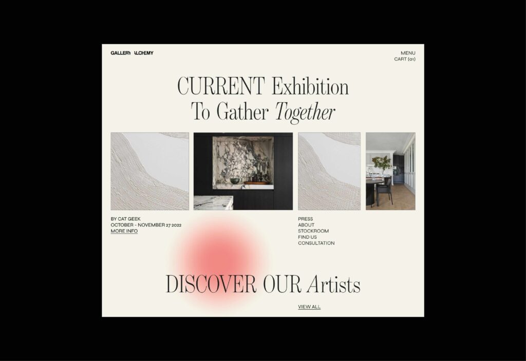
Gallery Alchemy was a full rebrand and rename of the former Van Rensburg Gallery — repositioned as a modern art space that invites curiosity and quiet disruption. We partnered with the founder on a name that felt both elevated and evocative, speaking to the transformational nature of art itself.
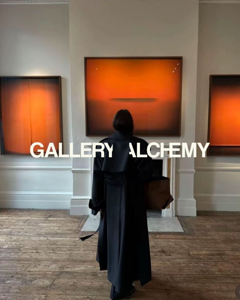
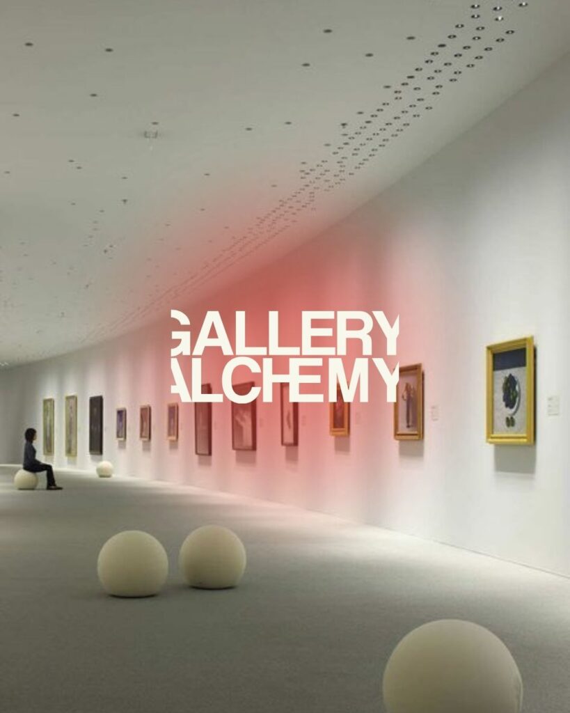
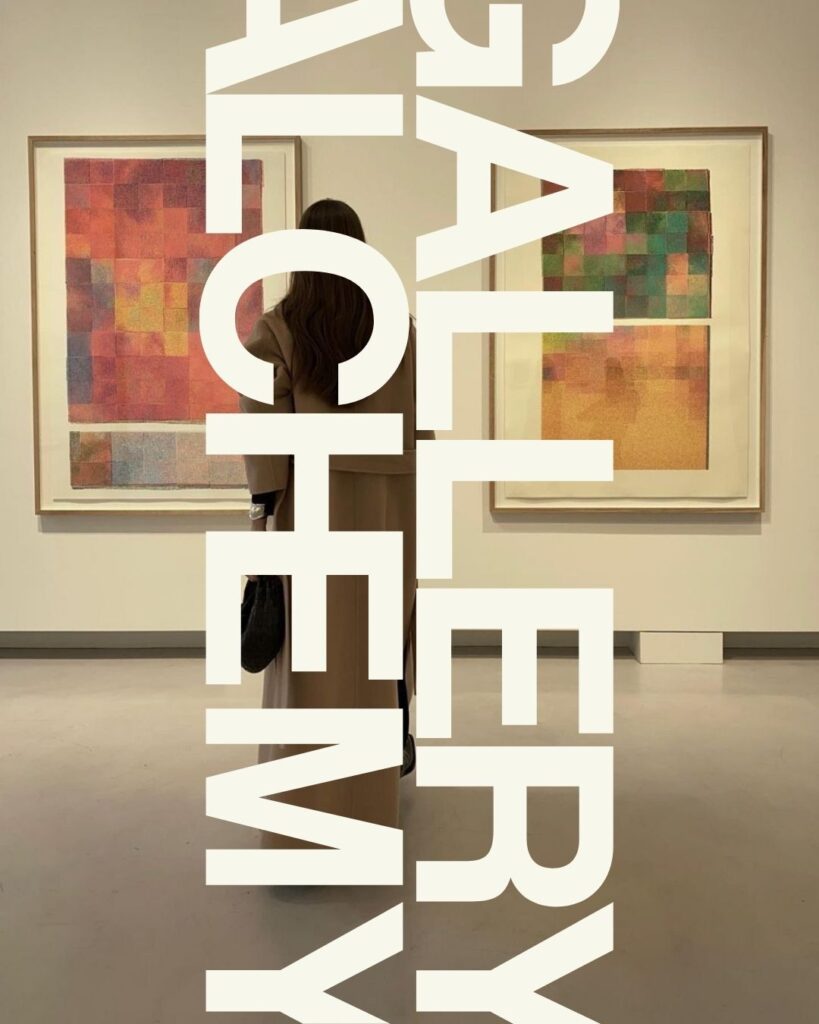
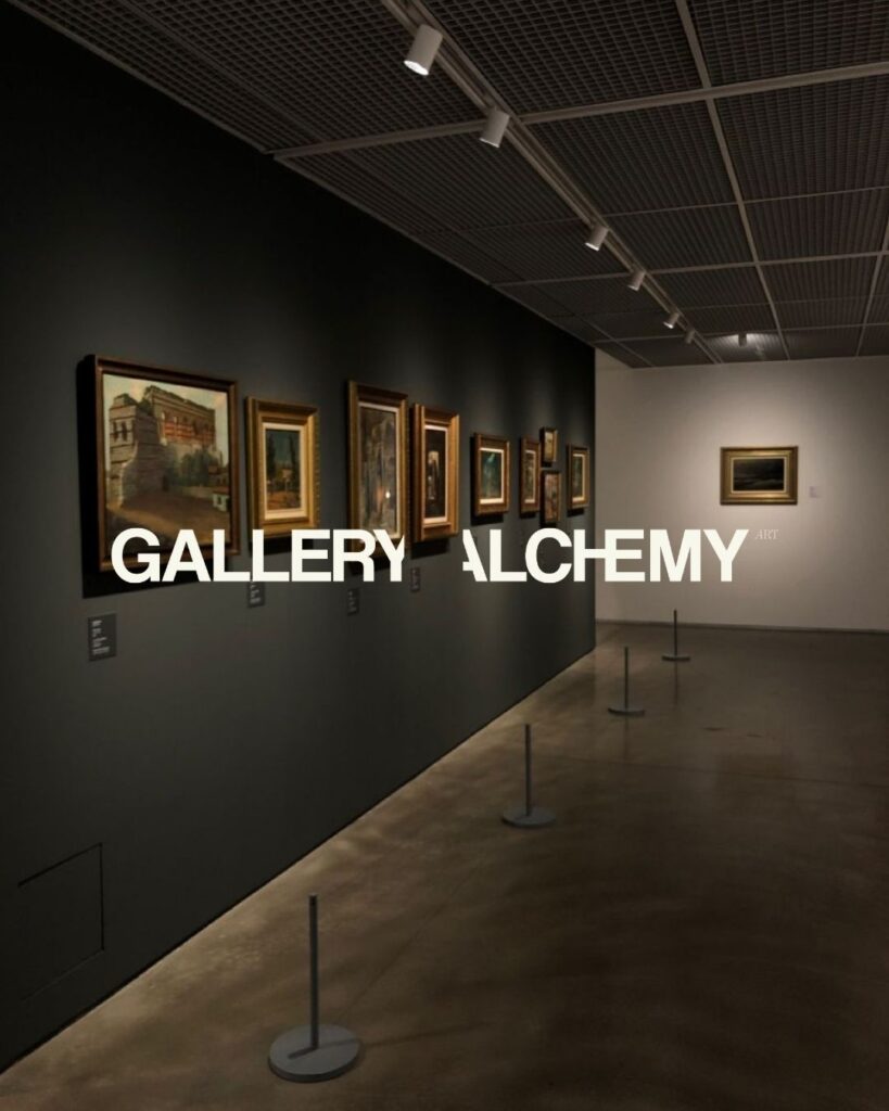
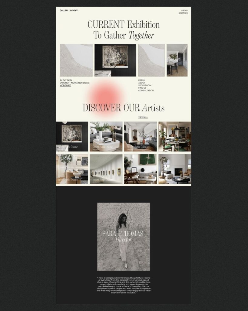
The logo system plays with perception: in the primary lockup, the sliced Y and A create an invisible box — a subconscious cue that this gallery lives outside the frame. In the stacked version, “GALLERY ALCHEMY” is cropped into a bold block, creating a structural tension that mimics the gallery experience — where boundaries blur between medium and message.
We combined bold sans-serif type with subtle serif accents to soften the geometry without compromising strength. A custom “sun-leak” emblem acts as a mood signature: diffused, intuitive, and almost atmospheric. The rich orange hue was chosen intentionally — a color that speaks to both happiness and warmth, inclusion and vitality. The full brand system is designed to feel minimal but not cold, modern but not clinical — a container for art that moves.

“I honestly couldn’t have done this without MOK. From the very beginning, they carried so much of the stress I was feeling and turned it into something beautiful. They truly listened — not just to what I said, but to everything I was trying to express beneath the surface. The brand they created feels like me in a way I didn’t even know was possible. I’m completely in love with the result. MOK was a total saviour throughout this process — thoughtful, calm, and completely aligned with the vision from start to finish.”
[Founder, Gallery Alchemy]
We curate brands that feel as good as they look. Ready for your idea to come to life?
